.avif)
STRATEGY & DESIGN / EXPERIENCE DESIGN
Experiences That Feel Like One Company
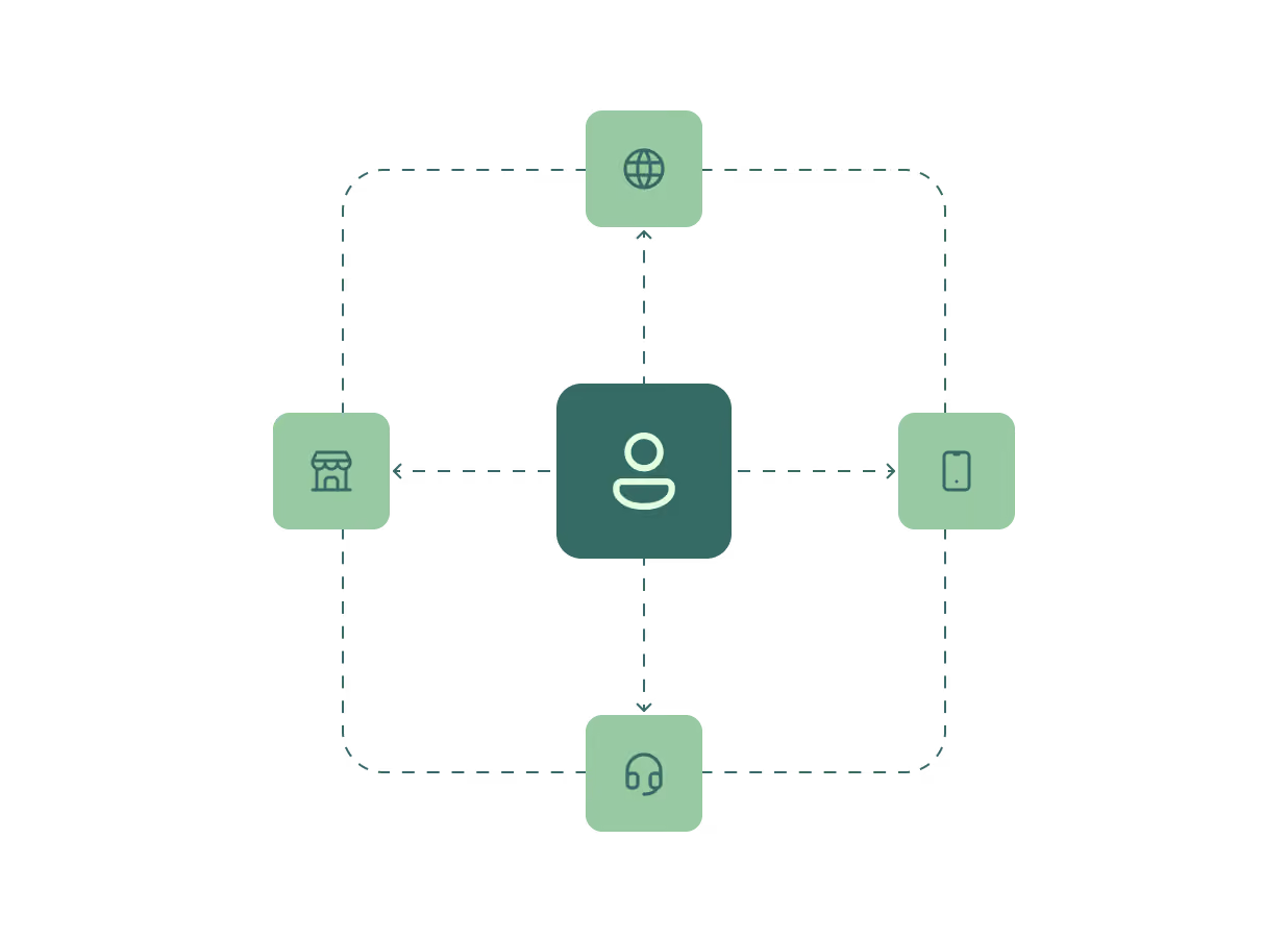
Zaelab designs the storefront, portal, and service experience as one, so a customer feels the same brand no matter which channel they're in.
WHEN IT'S USED
When the Experience Feels Disconnected
A customer who feels a different brand on the storefront, the portal, and the service desk notices the seams even when the backend is sound.
Every gap in that experience costs trust and repeat business.

WHAT'S INVOLVED
What Experience Design Covers

Design Built on the Journey
Interface and interaction design grounded in the journey map and personas coming out of Strategy & Journey Mapping, not designed in isolation from them.

Interfaces Built to Convert
Navigation, search, and checkout that reduce the steps to purchase.

One Experience Across Channels
The storefront, the portal, and the service desk behave the same way.

Content That Supports the Purchase
Product data, documentation, and specifications attached to the products they describe.

Design Systems That Hold
Components and patterns built once and reused across every channel, so consistency doesn't depend on manual review.

THE OUTPUT
What We Deliver

A design system covering the storefront, portal, and service channels

Interface designs for the priority flows, tested against conversion goals

A content model tying product data to the experiences that use it

An omnichannel style guide for teams building on the system after launch
PART OF THE WHOLE
Where This Fits in the Work
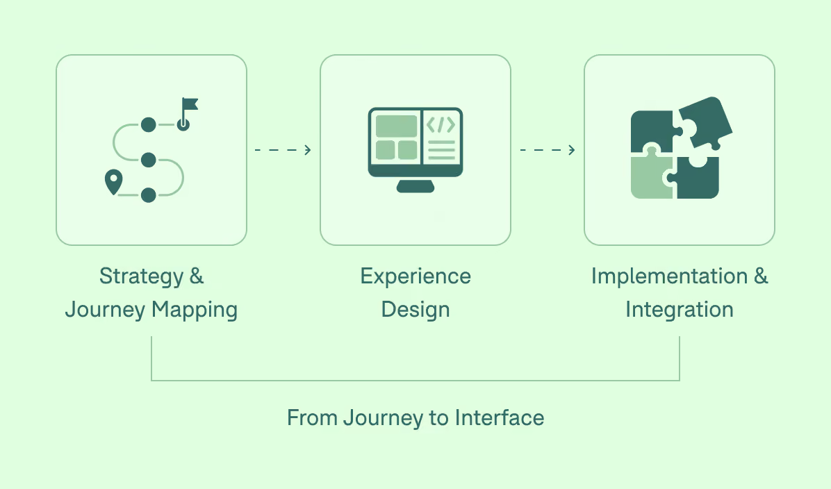
Experience Design follows Strategy & Journey Mapping, taking the journey map and personas and turning them into the interface. It feeds directly into Implementation & Integration, where the design gets built.
OUR APPROACH
Built and Delivered by Practitioners
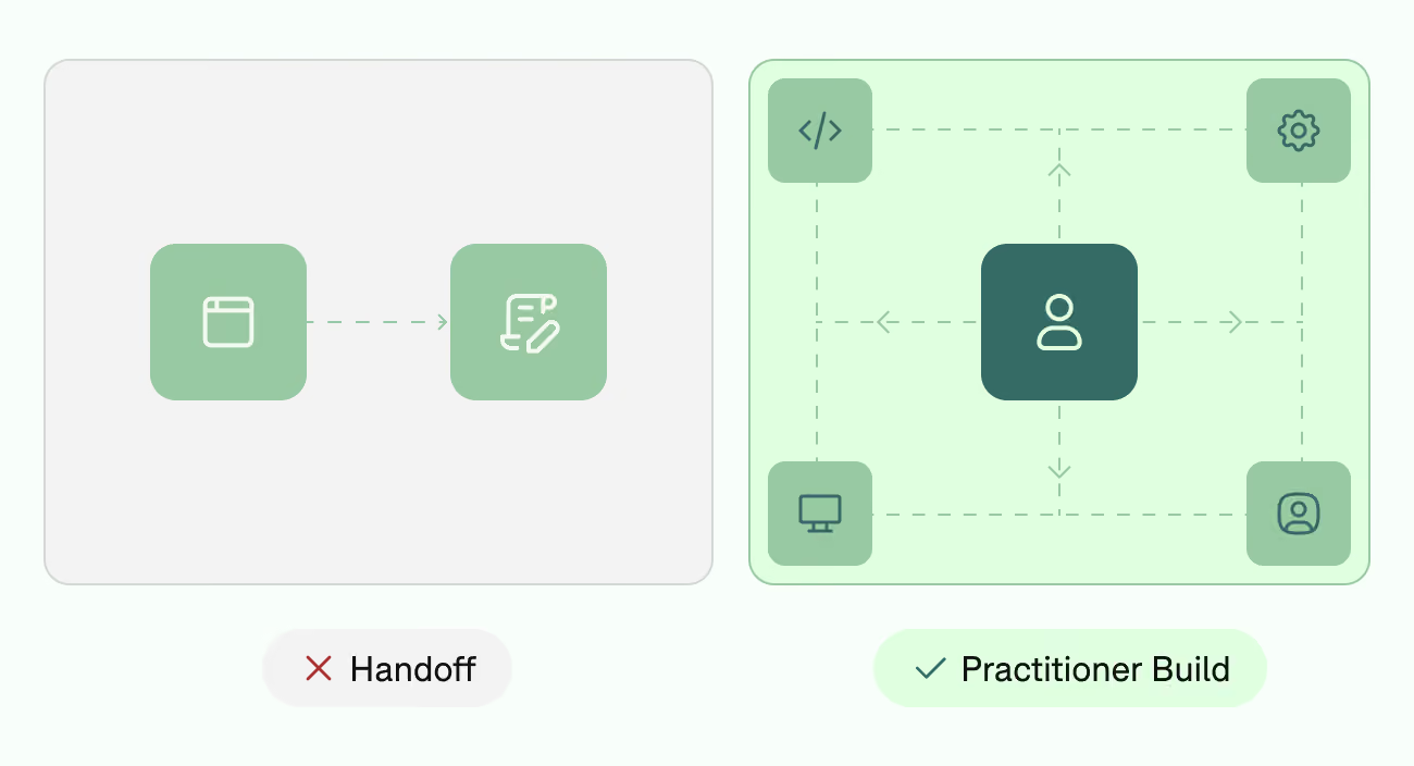
Zaelab has designed customer and service experiences across the whole revenue journey, on every platform your business runs on. The team designing the experience is the same team that has to make it work in production.
IN PRACTICE
Results You Can See
Read Success Stories

60%
Of Sales now flow through digital channels
Winner
Enterprise B2B eCommerce Manufacturer of the Year
“The Zaelab team has been fantastic through the entire project, and we couldn’t be more appreciative. The tireless work and effort everyone is putting in is paying off. ”

Jared Abelson
Head of E-Business and Digital Innovator